

Windows, Developers, and Experiences
Team Identity & Collateral

I joined the team shortly after a re-org, and began helping them build an identity that would bring clarity, focus, and a sense of pride to the group.
After coming up with many directions we finally landed on a logo mark; a ‘W’ shape that contains the letters ‘D’ and ‘X’ (for Windows, Developers, and Experiences), that also contains imagery of a foldable device as nod to current and upcoming Surface devices the team is creating. We chose a gradient color scheme, from the existing Microsoft palette, to bring a sense of modernity, tech, and inclusivity to the forefront, while also including transparency and shadows for depth, looping in Microsoft’s fluent design system.

Once the identity was approved, I begin rolling out the brand across team collateral, including:
Sub-brand logomarks and colors
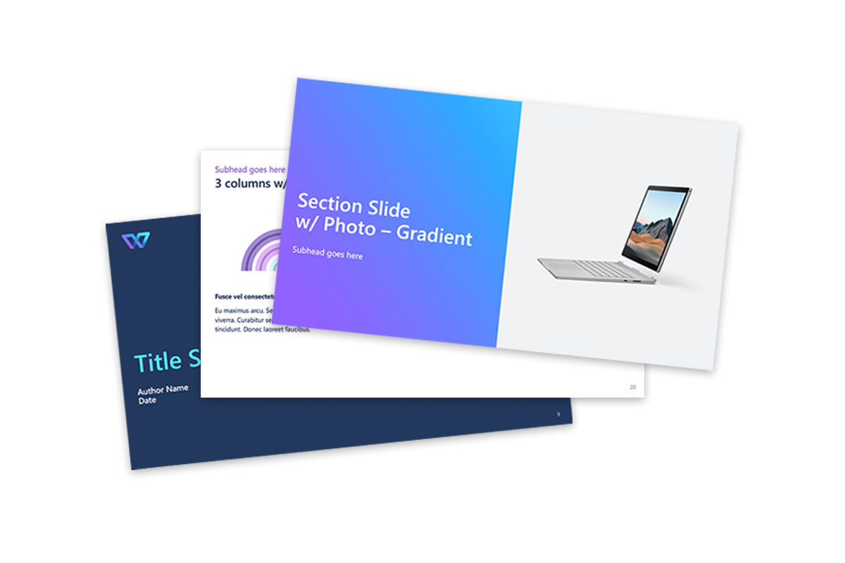
Team powerpoint and email templates
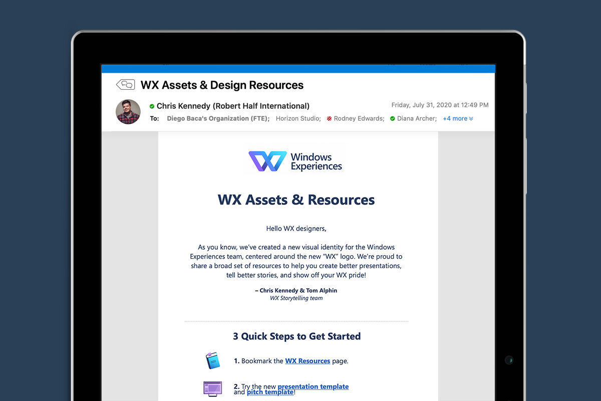
An internal resource website with assets for team members to use
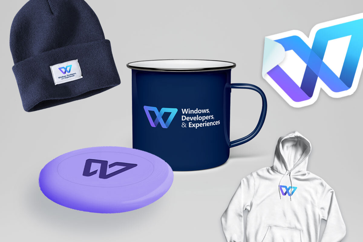
Posters, swag and desktop / Teams backgrounds
External facing work
An important part of WDX is the Windows Insider Program — a platform used to push updates to test audiences, as well as communicate upcoming changes to online outlets.

One example of a successful Windows Insider Program release, was when they announced their refreshed start menu update in July 2020. The update patch was sent to the test audience, but they needed a visual to get people excited. I created this simple before / after gif to help communicate the change, and it ended up getting a lot of traction.
This simple gif created quite a stir and was shared thousands of times by news outlets and users around the world, resulting in update downloads at all-time highs.